Learn CSS
What is CSS?
CSS is the language we use to style a Web page.
- CSS stands for Cascading Style Sheets
- CSS describes how HTML elements are to be displayed on screen, paper, or in other media
- CSS saves a lot of work. It can control the layout of multiple web pages all at once
- External stylesheets are stored in CSS files
Feel free to check this CSS guide that goes more in depth at any time.
Syntax
CSS consist of a set of rules that are interpreted by the browser and are applied to corresponding elements in the web page. Each rule is made of three parts:
-
Selector: An HTML tag at which a style will be applied. This could be any tag like
<h1>,<table>, etc. -
Property: Type of attribute of HTML tag. They could be color, border etc.
-
Value: Values are assigned to properties. For example, color property can have value either
red,#F1F1F1, etc.
Rule:
selector {
  property: value;
}
You can have multiple types of selectors, below is a quick list.
Universal selector
Matches any element type.
* {
   color: #000000;
}
So in this case every element is going to be black.
Type selector
Selects an element of a specific type: h1, p, table, etc.
h2 {
   color: #0000FF;
}
Descendant selector
ul em {
   color: #000000;
}
Applies the color to <em> elements only inside a <ul> tag.
Class selector
You can define style rules based on the class attribute of the elements. All the elements having that class will be formatted according to the defined rule.
.black {
   color: #000000;
}
This rule renders the content black for every element with class attribute set to black in our document.
You can even make it more particular, only rendering the content in black for <h1> elements with a black class.
h1.black {
   color: #000000;
}
You can then use this class and apply it to an HTML element like this:
<p class="black center">
   This paragraph will be styled by the classes black and center.
</p>
Id selector
You can define rules based on the id attribute of the elements. All the elements having that id will be formatted according to the defined rule. You should not have more than one element with the same id in the same page.
#login-button {
   color: #FF0000;
}
The true power of id selectors is when they are used as the foundation for descendant selectors. For example:
#login-form h2 {
   color: #0000FF;
}
Lets us only apply the blue color to the h2 if it's a descendant of the login form (which should be unique).
Child selector
This rule is very similar to the descendant selector, but applies only to direct childs.
body > p {
   color: #000000;
}
Will render all the paragraphs in black if they are direct child of <body> element.
Attribute Selectors
You can apply styles to to HTML elements with particular attributes like this:
input[type = "text"] {
   color: #000000;
}
This will match all input elements with type of text (and not submit for example).
Grouping selectors
You can apply a style to many selectors just by separating the selectors by a comma like this:
h1, h2, h3 {
   color: #36C;
   font-weight: normal;
   text-transform: lowercase;
}
Let's practice
In order to practice CSS selectors, let's complete this game here.
Layout
When you use CSS to create a layout, you are moving the elements away from the normal flow. The methods that can change how elements are laid out in CSS are as follows:
- The display property — Standard values such as block, inline or inline-block can change how elements behave in normal flow.
- Floats — Applying a float value such as left can cause block level elements to wrap alongside one side of an element, like the way images sometimes have text floating around them in magazine layouts.
- The position property — Allows you to precisely control the placement of boxes inside other boxes. Static positioning is the default in normal flow, but you can cause elements to be laid out differently using other values, for example always fixed to the top left of the browser viewport.
- The Flexbox Layout - aims at providing a more efficient way to lay out, align and distribute space among items in a container, even when their size is unknown and/or dynamic.
The display property
The main methods of achieving page layout in CSS are all values of the display property.
For example, the reason that paragraphs in English display one below the other is due to the fact that they are styled with display: block. If an HTML element has display: block, it tries to fill all the available space horizontally.
If you create a link around some text inside a paragraph, that link remains inline with the rest of the text, and doesn’t break onto a new line. This is because the <a> element is display: inline by default. display: inline sets the height and width of an element to the minimum possible and you can't change the width or height properties of the HTML element. If you want to have the same properties as display: inline but also have the possibility to change width or height, you must use display: inline-block.
Finally display: none removes the element from the layout. The display property has more available options but these are the most commonly used.
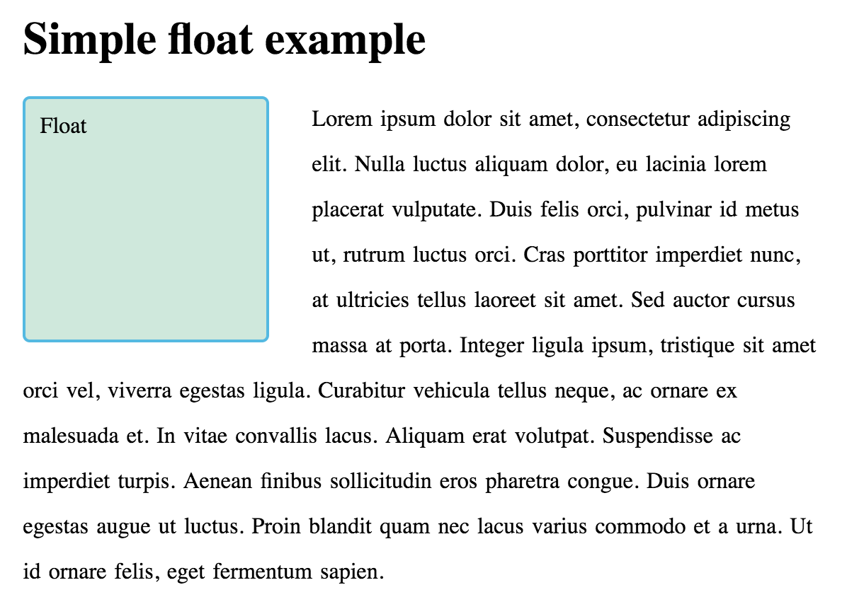
Floats
Floating an element changes the behavior of that element and the block level elements that follow it in normal flow. The element is moved to the left or right and removed from normal flow, and the surrounding content floats around the floated item.
The float property has four possible values:
- left — Floats the element to the left.
- right — Floats the element to the right.
- none — Specifies no floating at all. This is the default value.
- inherit — Specifies that the value of the float property should be inherited from the element's parent element.
<h1>Simple float example</h1>

<div class="box">Float</div>

<p>
  Lorem ipsum dolor sit amet, consectetur adipiscing elit. Nulla luctus aliquam dolor, eu lacinia
  lorem placerat vulputate. Duis felis orci, pulvinar id metus ut, rutrum luctus orci. Cras
  porttitor imperdiet nunc, at ultricies tellus laoreet sit amet. Sed auctor cursus massa at porta.
  Integer ligula ipsum, tristique sit amet orci vel, viverra egestas ligula. Curabitur vehicula
  tellus neque, ac ornare ex malesuada et. In vitae convallis lacus. Aliquam erat volutpat.
  Suspendisse ac imperdiet turpis. Aenean finibus sollicitudin eros pharetra congue. Duis ornare
  egestas augue ut luctus. Proin blandit quam nec lacus varius commodo et a urna. Ut id ornare
  felis, eget fermentum sapien.
</p>
.box {
  float: left;
  width: 150px;
  height: 150px;
  margin-right: 30px;
}
More information about the float property here.
Positioning techniques
Positioning allows you to move an element from where it would be placed when in normal flow to another location. Positioning isn’t a method for creating your main page layouts, it is more about managing and fine-tuning the position of specific items on the page.
There are however useful techniques for certain layout patterns that rely on the position property. Understanding positioning also helps in understanding normal flow, and what it is to move an item out of normal flow.
There are five types of positioning you should know about:
- Static positioning is the default that every element gets.
- Relative positioning allows you to modify an element's position on the page, moving it relative to its position in normal flow — including making it overlap other elements on the page.
- Absolute positioning moves an element completely out of the page's normal layout flow, like it is sitting on its own separate layer. From there, you can fix it in a position relative to the edges of its nearest positioned ancestor element (element without static position).
- Fixed positioning is very similar to absolute positioning, except that it fixes an element relative to the browser viewport.
Flexbox Layout
The main idea behind the flex layout is to give the container the ability to alter its items’ width/height (and order) to best fill the available space (mostly to accommodate to all kind of display devices and screen sizes). A flex container expands items to fill available free space or shrinks them to prevent overflow.
Flex container
To use flexbox you need to define a flex container. A flex container enables a flex context for all its direct children.
.container {
  display: flex; /* or inline-flex */
}

Flex orientation
You can define the direction flex items are placed in the flex container. Think of flex items as primarily laying out either in horizontal rows or vertical columns. By default flex uses horizontal orientation.
.container {
  flex-direction: row | row-reverse | column | column-reverse;
}

Justify content
This defines the alignment along the main axis. It helps distribute extra free space leftover when either all the flex items on a line are inflexible, or are flexible but have reached their maximum size.
.container {
  justify-content: flex-start | flex-end | center | space-between | space-around | space-evenly |
    start | end | left | right... + safe | unsafe;
}

Align Items
This defines the default behavior for how flex items are laid out along the cross axis on the current line. Think of it as the justify-content version for the cross axis (perpendicular to the main-axis).
.container {
  align-items: stretch | flex-start | flex-end | center | baseline | first baseline | last baseline
    | start | end | self-start | self-end +... safe | unsafe;
}

Flex items

Flex grow
This defines the ability for a flex item to grow if necessary. It accepts a unit-less value that serves as a proportion. It dictates what amount of the available space inside the flex container the item should take up.
If all items have flex-grow set to 1, the remaining space in the container will be distributed equally to all children. If one of the children has a value of 2, the space in the container would take up twice as much space as the others (or it will try to, at least).

Let's practice flexbox
In order to practice flexbox, let's complete this game here.
Coding styles
There are multiple ways in which CSS code can be formatted. Since having as many coding styles as developers would be catastrophic, we have a way of formatting/styling CSS code.
At eagerworks we use Google's style guide. Take some time to take a look at it.
Exercise #1
Part A
To catch and address any issues early on and prevent them from compounding, please implement only the first two sections of the proposed UI. In this excercise we will use plain CSS (you will define all the styles/classes).
You can check colors, fonts and assets on Figma. Ask your mentor for some guidance into how to check font sizes, colors, etc.
Part B
Reimplement the previous part, but now using utility classes.
Part C
Add SASS to the previous part. You can use this command to recompile the CSS on every change:
sass --watch input.scss output.css
Once you have that in place, go ahead and implement the full UI.
Part D
Now it's time to make sure that the UI is responsive and looks good on any screen size. You will need to add media queries to your CSS.
Exercise #2
Tailwind is a CSS framework that makes web implementation a lot easier. It provides numerous predefined classes and utilities, allowing us to implement any UI quickly and in a maintainable way.
Please take some time to read a Tailwind's documentation (taking special care to the breakpoints section) and then reimplement the same UI as you did on the previous exercise, but now using Tailwind. If you need to override something, try customizing the theme.